Wednesday, November 19, 2008

Week 12: My Reactions

Your reactions to BDC 101 Digital Media--

Well first off I would like to say a big Thank YOU to all my teachers, as they have all been fabulous. My first semester of University is almost over, but I have had a great time learning what I love.

Throughout the semester I feel the Digital Media Lab was beneficial in the sense that I learned how to work certain programs, (ie Flash, Dreamweaver) that I will be dealing with in the near future. I was reading over my posts from day one where it asks, "what is your impression of the term digital media?" and I was not able to answer. After reflecting on what I have learned throughout the last 12 weeks, I would now have something to say.

I came into Radio and Television Arts, strictly wanting to pursue a career in television production. However, after learning of all the different career options and all of the different fields within Media, made me definitely consider some different routes. Although, I may not enter into the digital media field, it has been truly great to learn how to use certain programs that are going to be beneficial. I am still undecided of what aspect of media I want to get into, as I am still keeping an open mind for the television portion of this year. It is difficult to say if I want to follow this path when there is still so much more I get to learn.

For the overall course evaluation, I think much of the time we strayed away from course material. The only problem was that we did not really get into doing assignments during the class. We spent much time talking of the programs and what they "can do" rather than getting on a computer and doing it together. I believe that room for improvement would be to spend more time working on the computer, with the teacher assisting students with questions. I just found I was ususally rushed for time to try and get tutorials done, without actually remembering and soaking in all the steps and material.

I hope in the future that I will be able to use some of these programs again to create other projects. My creative ability was not to it's full potential this semester as I was new at all of the programs, therefore had to work with what I could do on the program. With more practise, I hope to use my creative ability to push my limits at creating new media projects. I am much more confident with digital software than I have been before because I actually was involved with "hands on" work in the lab. As for the overall course, I am taking away more knowledge of these programs as to using them, and of course what digital media is.


Saturday, November 1, 2008

WEEK 11: Dreamweaver

Topic Open for Any Discussion

For week 11 in the Digital Media Lab, we learned a little about HTML but focused more on Dreamweaver. Dreamweaver is the program in which we will be using in order to create our inclass website. I was never really aware of how to create a webpage, and it has been very interesting to create our own.

For my inclass website, I am going to create webpages dedicated to pictures and descriptions of my travels. I will call this site, "My Favourite Places," as I am going to focus on my three favourite destionations which I have been fortunate enough to travel to. I will mainly be describing Greece, Poland and Florida. I took some amazing photos when I was in each country/state, and would love to display them to my classroom and teachers. I am going to have each of these places as links that will open up a new page dedicated to that particular destination. I am really excited to use my new talent and applying it to create my own website.


This is an example of one of the pictures from Greece I will be using.
This is a picture of Athens from a viewpoint.


This is an example of one of the pictures I will be using from Poland.
This is a photo of the "old" part of town in Warsaw, Poland


This is a photo of the resort where I stayed on my trip to Florida.

WEEK: 10 "Web 2.0"

Five characteristics of Web 2.0 were discussed in lecture. For each of those characteristics, provide one real-world example from the Web and explain how it exemplifies that particular characteristic. At least 3 of your 5 examples must be examples that were not provided in the lecture slides.

This week we focused on the characteristics of Web 2.0. It was interesting to learn these characteristics because I was never aware of what was put into creating a web, and the characteristics that came along with it.

5 Characteristics of Web 2.0

Dynamic content: viewable on multiple platforms.
An example of this is a website that is constantly changing. This can be any news website, as everyday new photos and text are uploaded daily, like CTV

User contribution: user genertated content/ user generated value
An example of this is a site such as Blogger. Anyone is able to create their own ''online blog' and can add in any content they like. Anyone can comment on the blog posts, therfore it provides both generated content and user generated value.

Social Media: online media that provides opportunities for socializing.
An example of social media, would be any type of chatroom. Anyone can create an account with a username and discuss openly with other users online. This results in social contact with people over the net. Another example would be online dating servies like "Plenty of Fish".

Online Applications: online software, log-ins ect.
Some examples of online software would be programs like word processor, microsoft excell, or powerpoint. Any programs that you can buy or install on your computer that are to be used online.

Harnessing Collective Intelligence: Tagging.
An example of tagging would be youtube.com where you can go online and tags videos to make certain search engines easier to find.

WEEK 9: Animation - Twas the Day of Halloween


Post Animation assignment along with Artist's statement
I created a digital animation of a house evolving into a 'haunted house' over the period of the day. I strived to create a fun animation that would be enjoyable for people to watch. I wanted it to be simple, but of course be challenging for me to create. I had about thirty layers within this animation, all containing different moving elements. I started off with just the basic houses on land, and slowly added in all the other motion tweens. All of my creations such as the houses, pumpkins, the sun and trees, are all made out of regular shapes that were tweaked in order to give them a certain look. I used text that I felt represented a Halloween font. It has rougher edges, and looked “spooky.” I took the sound effects and music from the beds in ITunes in order to add sound. I used sound effects for the bouncing pumpkins, for the cracking of the graves coming out of the ground, and the window panel falling off the house. Also, adding in the fun music for daylight and transitioning into haunted Halloween music for night was a nice touch.

The target audience for this particular animation would be children ages 3 - 12. I envision this particular age group because this is a short, simple animation that has fun music and cute characteristics. It contains many basic shapes that children can learn from and recognize at a young age. It is very easy to understand, and children would be able to depict the transitions and shapes. There are many different bright colours present, which children are very normally drawn too. Children at a young age are always into Halloween; therefore this is a simple way to interpret this event, and the stories of “spookiness” at night.

The challenges I suffered while creating this assignment were endless. I had the hardest time creating an animation that would be easy for me to create. I have never used this program before, and found it very stressful to create an animation when I had very little understanding of how to work the Flash program. I had several attempts with different drawings and pictures and ended up using this animation, with very basic shapes and motions. I had to have assistance in creating certain actions and motion within the program, several times. Despite my countless troubles with this stressful program, I am very proud of myself for working hard and making it work to the best of my abilities.

Overall, I think I did the best job I could with it being my first time using Flash. I was very pleased with myself being able to accomplish this much in such a short amount of time. The finished product of this piece is one I am content with. I think it is a fun animation and I had fun doing it, despite the rough patches. I trust I was able to successfully address the target audience as it is a basic cartoon animation for children. I am excited to learn more and possibly make another animation again!

WEEK 8: Album Covers

Go to alexsteinweiss.com and search through the covers. Find a cover that reminds you of a contemporary album cover and post both.

Out of the three topics this week, I chose to visit alexsteinweiss.com, and through my searches found a photo that reminded me of Wisely's 2007 album cover.
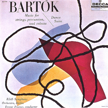
The picture below to the left is the art of Alex Steinweiss. The picture to the right is an '07 album cover for Wisely. This particular "Bartok" piece of Steinweiss's reminds me of the design on Wisely's album because of the bold shapes and colours, along with the scribbling effect throughout the image. The black lines are defient and make for an interesting effect on the pieces. Although the picture to the right is more modern than the other, they both seem to contain similar aspects. The calm, subtle background colour, the bold coloured shapes, and the black lines through the piece. The "Wisley" piece, tends to go more into depth with the text of the word as it seems to follow the effect of the black lines. It looks handwritten therefore is driven into the line effects. When I saw this particular Steinweiss piece, it immediately made me think of this particular piece.


Image 1 found on Alex Steinweiss website http://alexsteinweiss.com/pages/images/022.jpg
Image 2 found on http://www.prweb.com/prfiles/2007/08/16/267338/WiselyCover500x500.jpg

WEEK 7: Personal Topic Choice

Decide for yourself what aspect of the digital media class you want to reflect on or explore further in your blog post for this week

This week our Digital Media Lecture was cancelled.

This week in our audio portion, we focused on Sound FX in movies. It was so very interesting to me to learn of all the aspects of audio for film. I was fasinated to see the video of Indiana Jones, and how they create the different sounds such as the waves and the steal toed boots on the boat surface. I was so glad to have one of these classes because I was astonished at all the time and effort that goes into the movies. I was never aware of it. I am really looking forward to next semester, and the years to come, when we can work with audio for film. I am excited to produce our own personal SFX in our lab, and get a feel for what the professionals due. I have always had a passion to pursue a career in television or film, but was never sure what aspect I would like to do. After having this class, post-production is definitely an interest that I am excited to learn more about.

In our Digital Media lab we continued working with the program Flash, working on motion. We worked on creating a bumble bee and having it fly around the screen. We also had to add in sound FX to make the bee "buzz." This was a good assignment, as I learned how to add in sounds to the animations, which will be beneficial in my animation.

Monday, October 27, 2008

WEEK 6: Animation - T'was the Day of Halloween

Describe your idea for your Animation/Interactivity assignment.

At the time of working on this animation, Halloween is just around the corner. I have been having a very tough time on deciding what creation I want to make, but the thought of Halloween is stuck in my mind. I have never had any experience with the Flash program, and am struggling to understand exactly how to do anything and everything with this program. I have decided to do my animation of a house in pure day light and the transition to turn the house into a haunted house at night. I am going to use very basic shapes and bright colours, as I am gearing my demographic to young children.

What inspired this idea?

There is no particular inspiration that helped me come up with this animation. I had a phone conversation with my mom and we spent time discussing different things I could do. With our combined brainstorming, and the thought of Halloween, I thought of turning a ordinary house into a haunted house. With that decision in mind, my mom helped me think up ideas of what could be incorporated into the animation.

Which examples shown in lecture/lab gave you inspiration? Any Internet examples?

There were no specific examples in class or on the internet that gave me imspiration. This was just thought up in my mind.

What will you have to do to accomplish your idea (e.g. any research, skill building, etc.)? Which techniques in Flash will you employ to make it happen?

In order to accomplish this idea, I am going to have to be comfortable enough with the program to create the image in my mind. I am going to have to spend much time advancing my technical skills with Flash in order to get everything to work smoothly and efficiently. I am also going to need assistance from people who understand this program well.

Tuesday, October 14, 2008

WEEK 5: CD Cover Assignment

Post your Poster or CD cover to your blog along with your Artist's Statement

I created a CD cover that would communicate a message to those who are or who have ever suffered from a breakup. I strived to create a heart-rending story by altering the scene into black and white. I used my friend, Sinead, as my model for this photo. I chose to position Sinead against a tree, facing away from the audience to represent isolation and hurt. I placed her legs straight out in front of her to draw the viewers eye to the title of the CD, “A New Day.” This was to look as though she is looking towards ‘a new day,’ looking to move out of the dark. Also, I chose to cut out a bright butterfly from a picture I took and incorporate it, as I feel it is a strong representation of a breakup. The beginning of a relationship is like being secure in a cocoon, safe and comfortable. However, once the cocoon cracks, the opening into the ‘new’ world without that security and familiarity is new and scary. Finding the strength to move on and leave is very emotional for many people.

Although the CD is referred to as “A New Day,” it would contain breakup songs, as they help the ‘healing’ process. They aid the individual to move on from the past and into the future, into “a new day.” The target audience for this particular CD would be women, ages 18 – 30. I envision this particular age group because this is the range when women are looking for love and struggling to find it. Many have been through a painful breakup. In general, women tend to be much more emotionally involved than men, therefore have a much different way of dealing with it.

The challenges I suffered with during this assignment were getting the right lighting in the shot. Originally, I wanted to create the same picture but with light rays streaming through the top left corner. I wanted to use light; however I was unable to get a shot with distinct enough detail and the right lighting. Despite that, I was able to learn how to use some tools within Photoshop. I learned how to crop out images, such as the butterfly, and how to use the layering tactics. I have not had too much experience with this program; therefore it was a long process to gain the full understanding of how everything works. The finished product of this piece is one I am content with. I think it is an accurate interpretation of my message. My original expectations were to have light rays, but I am content with the decision to go with the butterfly, I believe it symbolizes hope. I trust I was able to successfully address the target audience for this piece because it is a very common issue that all women have to struggle to overcome.

What I have learned from the critique from the class and Professor Warwick, was that I should not have incorporated the butterfly. I was told that it was a "cliche" that was terrible. I thought that it was a nice element to the picture, however they had valid reasons to think otherwise.

Saturday, October 4, 2008

WEEK 4: Lesson On Typography

Find 3 Designs and discuss the typographic choices made in each design.

I never realized how much thought and skill goes into creating different fonts. It was very interesting to have a lesson on typography. I had no idea how something as simple as a type of font, could give a sense of emotion, and a sense of change to how an advertisment can be portrayed. It was very interesting to learn the patterns arranged by type, and theerms of each individual element. Seeing the different examples that Professor Warwick showed us was very appealing.

Advertisement 1: 30 Days of Night ( Found at http://www.best-horror-movies.com/image-files/30-days-of-night-horror-movie-poster.jpg, October 2008)


This movie is a horror film. The font chosen for this particular poster has rough edges that cut off the letters on the ends. The font is choppy, rigid and gives the poster a "creepy" feel. For a horror movie, you do not want a font that has smooth lines and gives the poster a nice clean look. Instead you want the font to give across the same message as the movie poster would. This type of font chosen, gives this poster a feel of danger and discomfort. The center on of the "0" has a dot in the middle, which could be interpreted as an eye, staring out at the viewer.


Advertisement 2: Fun Dip (Found at http://www.candy.org/fundiplarge.jpg , October 2008)


When looking at the packaging of Fun Dip the big, bold, white letters stand out over the busy background. The choice of a bold font with smooth straight edges is a good effect for the candy. This type of candy consists of a rounded candy stick that is used to dip into a variety of different flavoured sugars and eaten. The rounded edges of the words, reflects what type of can is within the packaging. The font is simple, yet it is fun and works well for the young demographic this product strives to appeal to. Young children would see this packaging, and the font would stand out, grabbing their attention as they walk buy. This font is definitely a good choice for this product, as it is fun, smooth and enjoyable, similar to the candy it is advertising.


Advertisement 3:
Ice Age (Found at http://www.popartuk.com/g/l/lgfp1623+scrat-the-squirrel-rat-ice-age-2-poster.jpg, October 2008)


The font used for this movie poster is a perfect choice. The movie is a story arctic animals living in the Ice Age. At first glance, the blocks of white lettering is very "eye grabbing." The lettering chosen represents blocks of ice and snow which is relevant to what the movie is about. The sqaure and curved edges and thinkness of the letters gives a heavy feel, as the words actually are ice blocks shaven out into letters. The lines of the font as not perfectly straight to resemble to mountains of ice surrounding the bottom of the frame.


Advertisement 3: Ice Age (Found at http://www.popartuk.com/g/l/lgfp1623+scrat-the-squirrel-rat-ice-age-2-poster.jpg, October 2008)

Saturday, September 20, 2008

WEEK 3: "Colour"

Decide for yourself what aspect of the digital media class (lecture and/or lab) you want to reflect on or explore further in your blog post for this week.

This week in the digital lab I was really intrigued by learning all the different tools and filters that are in Fireworks. It was very interesting to learn how to change photographs from its original form into a different picture using a variety of tools. We learned how to create basic shapes and how to alter them, add textures, and add different tints and shades to the colours. All the information that I learned in this class will be very beneficial for the poster and/or C.D cover assignment.

In this week’s lecture we learned many new terminologies, most of which involve colour. I was aware of the colour wheel from high school, but it was good to be refreshed about how to use it, and how it works. I was able to remember how to find complementary colours, analogous colours, and monochromatic colours using the colour wheel and am now aware of the definitions of each. I am also now aware of how to add tints and shades to colours and which colours really complement each other.


Complementary Colours
Orange & Blue


Analogous Colours


Monocromatic Colours
Shades of Blue


We also went through a variety of radio stations and looked at the demographics and formats of each. We were able to see statistics as to what radio stations were more popular in Canada and the United States. It was interesting to see how the demographics in both countries are very different from each other, as we have very different preferences when it comes to the choice of music.
Overall this week I learned a lot about colour and fireworks, which will be very helpful in many different classes, and future assignments.

Saturday, September 13, 2008

WEEK 2 "C.R.A.P Principles For Visual Desgin"

Describe the CRAP Principles in 4 images.

In this weeks lecture I learned of the 4 basic CRAP Principle of Visual Design and how to analyze them within a variety of different works. It was very interesting to study each individual example that Lori showed us, and see the contrast, repitition, alignment or proximity that was within each photo. I was able to learn that something just as simple as the CRAP Principles can change the way a veiwer looks at a piece of art. It is the message it sends out to the people.

Alignment and Repetition


This poster of the hit movie "Juno" portrays examples of both repitition and alignment. It demonstrates repitition with the consistant orange horizontal lines throughout the poster. The organge lines give a sense of consistancy as they are shown in the background and on Juno's shirt. This aspect draws attention to the eye, and creates a design that is followed through the entire poster. This poster is also a good example of alignment. This is because all the text is aligned on the right hand side, each sentence ending at the same point down the page. This creates organization and a neatness to the poster instead of being overcrowded and confusing.

Image received from website on September 14, 2008
<<
http://blog.afi.com/main/wp-content/uploads/2007/12/juno-poster2-big.jpg>>

Contrast
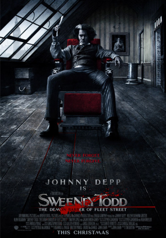
This poster is from the movie "Sweeney Todd" and is a great example that demonstrates the element of contrast. The white lettering on a black background is a great way draw the eye in to the title of the movie. The large font makes it stand out, but does not take away from Johnny Depp as the focal point. The contrast of red, white and black is very distinctive. The white, clear glass window contrasts against the dark black room. The white window looks as though it is casting light on Depp's face, as it is the only light that is shinning through. The red chair he is upon is very distinctive, and demonstrates a good taste of contrast. All the text is grouped together at the bottom of the page which is an example of the element proximity. This poster displays good use of both contrast and proximity.

Image received from website on September 14, 2008
Proximity

This Harry Potter poster demonstrates the element of proximity. It does a great job in grouping related items together into a cohesive group. All of the main characters within the movie that are displyed on the cover are grouped together along the middle section of the poster. This displays great organization. Also, all the text is grouped at the bottom of the page which does not take away from the main focus. The title of the movie is an eye catching element however it is not distracting. As for contrast, the white bolded font contrasts the black background, and the white smog creates a eery effect that is intriguing. This poster is one that is very effective to the public eye.

Repetition


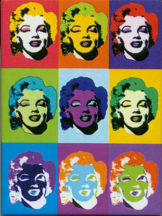
This poster of icon Marilyn Monroe demonstrates both repetition and alignment. Repetition is the main principle portrayed in this poster as there are reoccuring shapes, colours, and images. The poster is divided into 9 repetative squares that are each the same size. Within these sqaures there is a reoccuring face of Marilyn Monroe, again demonstrating repetition. Alignment is also present within this poster, as there are vertical and horizontal lines evenly dividing the poster into squares.

Image received from website on September 14, 2008
http://www.d.umn.edu/~cstroupe/ideas/assets/repetition_warhol2.jpg

Tuesday, September 2, 2008

WEEK 1 "What Is Digital Media?"

September 2, 2008

What were your impressions of the term Digital Media?

Radio and Television Arts has always been a strong interest of mine, however, I was never aware of how many different aspects of media were involved within this program. Before this lecture, I was aware of the term "digital media" but never understood the true definition. I always understood digital media to be of technology that is interactive or displayed in a digital format.

Did your impressions change in any way after the first lecture, and if so, in what way?

After the lecture, I was able to learn that digital media can be represented by a variety of different forms of technology. After spending the first day in different classrooms, I was able to see that digital media is a important factor in Radio and Television worldwide. I am now aware that digital media refers to the digital content that allows people worlwide to communicate. It is a mixture of both digital technology & the creativity of the individual. Digits. Zeros and Ones.

Why should a student in RTA take a course like this one in digital media?

After spending the first day in different classrooms, I was able to see that digital media is a important factor in Radio and Television worldwide. Digital media has a growing effect on our economy and influences every individual in one way or another. The media industry is growing at a vast pace and it is very beneficial for us, who want to pursue a career in this industry, to learn everything that we can and to understand all the aspects of radio and television media.