Saturday, September 20, 2008

WEEK 3: "Colour"

Decide for yourself what aspect of the digital media class (lecture and/or lab) you want to reflect on or explore further in your blog post for this week.

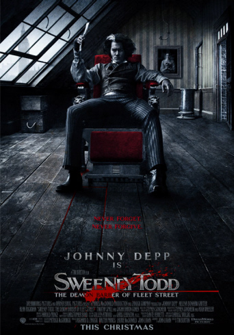
This week in the digital lab I was really intrigued by learning all the different tools and filters that are in Fireworks. It was very interesting to learn how to change photographs from its original form into a different picture using a variety of tools. We learned how to create basic shapes and how to alter them, add textures, and add different tints and shades to the colours. All the information that I learned in this class will be very beneficial for the poster and/or C.D cover assignment.

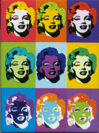
In this week’s lecture we learned many new terminologies, most of which involve colour. I was aware of the colour wheel from high school, but it was good to be refreshed about how to use it, and how it works. I was able to remember how to find complementary colours, analogous colours, and monochromatic colours using the colour wheel and am now aware of the definitions of each. I am also now aware of how to add tints and shades to colours and which colours really complement each other.


Complementary Colours
Orange & Blue


Analogous Colours


Monocromatic Colours
Shades of Blue


We also went through a variety of radio stations and looked at the demographics and formats of each. We were able to see statistics as to what radio stations were more popular in Canada and the United States. It was interesting to see how the demographics in both countries are very different from each other, as we have very different preferences when it comes to the choice of music.
Overall this week I learned a lot about colour and fireworks, which will be very helpful in many different classes, and future assignments.

Saturday, September 13, 2008

WEEK 2 "C.R.A.P Principles For Visual Desgin"

Describe the CRAP Principles in 4 images.

In this weeks lecture I learned of the 4 basic CRAP Principle of Visual Design and how to analyze them within a variety of different works. It was very interesting to study each individual example that Lori showed us, and see the contrast, repitition, alignment or proximity that was within each photo. I was able to learn that something just as simple as the CRAP Principles can change the way a veiwer looks at a piece of art. It is the message it sends out to the people.

Alignment and Repetition


This poster of the hit movie "Juno" portrays examples of both repitition and alignment. It demonstrates repitition with the consistant orange horizontal lines throughout the poster. The organge lines give a sense of consistancy as they are shown in the background and on Juno's shirt. This aspect draws attention to the eye, and creates a design that is followed through the entire poster. This poster is also a good example of alignment. This is because all the text is aligned on the right hand side, each sentence ending at the same point down the page. This creates organization and a neatness to the poster instead of being overcrowded and confusing.

Image received from website on September 14, 2008
<<
http://blog.afi.com/main/wp-content/uploads/2007/12/juno-poster2-big.jpg>>

Contrast
This poster is from the movie "Sweeney Todd" and is a great example that demonstrates the element of contrast. The white lettering on a black background is a great way draw the eye in to the title of the movie. The large font makes it stand out, but does not take away from Johnny Depp as the focal point. The contrast of red, white and black is very distinctive. The white, clear glass window contrasts against the dark black room. The white window looks as though it is casting light on Depp's face, as it is the only light that is shinning through. The red chair he is upon is very distinctive, and demonstrates a good taste of contrast. All the text is grouped together at the bottom of the page which is an example of the element proximity. This poster displays good use of both contrast and proximity.

Image received from website on September 14, 2008
Proximity

This Harry Potter poster demonstrates the element of proximity. It does a great job in grouping related items together into a cohesive group. All of the main characters within the movie that are displyed on the cover are grouped together along the middle section of the poster. This displays great organization. Also, all the text is grouped at the bottom of the page which does not take away from the main focus. The title of the movie is an eye catching element however it is not distracting. As for contrast, the white bolded font contrasts the black background, and the white smog creates a eery effect that is intriguing. This poster is one that is very effective to the public eye.

Repetition


This poster of icon Marilyn Monroe demonstrates both repetition and alignment. Repetition is the main principle portrayed in this poster as there are reoccuring shapes, colours, and images. The poster is divided into 9 repetative squares that are each the same size. Within these sqaures there is a reoccuring face of Marilyn Monroe, again demonstrating repetition. Alignment is also present within this poster, as there are vertical and horizontal lines evenly dividing the poster into squares.

Image received from website on September 14, 2008
http://www.d.umn.edu/~cstroupe/ideas/assets/repetition_warhol2.jpg

Tuesday, September 2, 2008

WEEK 1 "What Is Digital Media?"

September 2, 2008

What were your impressions of the term Digital Media?

Radio and Television Arts has always been a strong interest of mine, however, I was never aware of how many different aspects of media were involved within this program. Before this lecture, I was aware of the term "digital media" but never understood the true definition. I always understood digital media to be of technology that is interactive or displayed in a digital format.

Did your impressions change in any way after the first lecture, and if so, in what way?

After the lecture, I was able to learn that digital media can be represented by a variety of different forms of technology. After spending the first day in different classrooms, I was able to see that digital media is a important factor in Radio and Television worldwide. I am now aware that digital media refers to the digital content that allows people worlwide to communicate. It is a mixture of both digital technology & the creativity of the individual. Digits. Zeros and Ones.

Why should a student in RTA take a course like this one in digital media?

After spending the first day in different classrooms, I was able to see that digital media is a important factor in Radio and Television worldwide. Digital media has a growing effect on our economy and influences every individual in one way or another. The media industry is growing at a vast pace and it is very beneficial for us, who want to pursue a career in this industry, to learn everything that we can and to understand all the aspects of radio and television media.